Is Your Visual Branding on LinkedIn Sending the Right Message?
First impressions are everything, and on a platform like LinkedIn, those first impressions are almost entirely visual.
Before a potential client reads a single word of your company's mission statement, they've already seen your logo, your banner image, and the professional headshots of your team.
These visuals are more than just decoration; they are a silent spokesperson for your brand, communicating professionalism, credibility, and values.
So, take a moment and ask yourself: is your visual branding on LinkedIn sending the right message?
The Building Blocks of a Professional Visual Brand
A powerful visual brand on LinkedIn is built on three key pillars. When these elements are strong and work together, they create a cohesive and memorable presence.
The Company Logo: Your logo is your company's face. It should be crisp, clear, and instantly recognizable. LinkedIn recommends a specific size for company logos, and it's essential that your file is high-quality so it doesn't appear blurry or pixelated on any device.
This is the icon that appears next to your posts and in search results, so it's a critical piece of the puzzle.
The Company Banner Image: This is your prime real estate. The banner image (also known as the cover photo) is the first thing people see when they land on your company page.
It's an opportunity to tell a story or showcase what you do. You could use it to:
Highlight a new product or service.
Show a photo of your team working together.
Display a powerful brand tagline or mission statement.
Feature a happy client or a successful case study.
Employee Profile Photos: Your team is your greatest asset. When your employees have professional, high-quality headshots, it adds a layer of human authenticity to your brand. Encouraging a consistent style, whether that's a unified background or similar poses, can help build a strong, cohesive company identity.
Remember, people do business with people, and these photos are a great way to showcase the individuals behind your brand.
Why Consistency is Your Secret Weapon
Imagine walking into a store where the sign outside is red, but the walls inside are blue and the employees are wearing green. It would be confusing, right? The same principle applies to your visual branding online. Consistency is the key to building trust and recognition.
Your LinkedIn presence should be a seamless extension of your other marketing channels. The colors, fonts, and style you use on your website, in your email newsletter, and on other social media platforms should be reflected on your company page and in your employees' profiles.
When your audience sees a consistent brand image everywhere they look, it reinforces your identity and makes you more memorable.
Common Visual Branding Mistakes to Avoid
While getting it right is important, avoiding common mistakes can be just as crucial. Here are some easy-to-fix errors that can undermine your professional image:
Low-Quality or Blurry Images: Pixelated logos or stretched-out banner images make your company look unprofessional and careless. Always use high-resolution files.
Leaving Your Banner Image Blank: This is a missed opportunity. A blank banner sends a message that your company is either inactive or doesn't care about its online presence.
Generic Stock Photos: While convenient, a stock photo of a person with a headset on can feel inauthentic. Invest in custom photography of your actual team and office space to build a more genuine connection.
Outdated Information: Ensure your company logo, tagline, and any other visuals are current. If you've recently rebranded, make sure your LinkedIn visuals are updated to match.
A Quick Checklist for a Visual Refresh
Ready to give your LinkedIn visuals a check-up? Use this simple checklist to review your current presence and identify areas for improvement:
Company Page Logo: Is it high-resolution and instantly recognizable?
Company Page Banner: Is it a custom design that tells your brand's story?
Employee Profile Photos: Do they have professional headshots that are in a consistent style?
Overall Consistency: Do your LinkedIn visuals match your website and other brand assets?
Relevance: Do your visuals accurately represent your company's current products, services, and values?
By putting thought and effort into your visual branding on LinkedIn, you're not just making your page look pretty; you're building credibility, fostering trust, and creating a powerful and lasting impression that can help drive your business forward.
FAQ
What are the correct image sizes for LinkedIn? The ideal sizes can change, but for a Company Page, the logo is around 300 x 300 pixels and the banner is 1536 x 768 pixels. For personal profiles, the photo is 400 x 400 pixels and the banner is about 1584 x 396 pixels.
Should my personal LinkedIn profile match my company's branding?
Yes, for consistency. Use a banner image that complements your company's colors or style, but keep your profile photo a professional headshot of you.
What if I don't have a professional photographer?
Use a high-quality smartphone. Find a clean, well-lit background and a friend to help. Face a light source like a window for a good, clear shot.
How often should I update my company's banner image?
Update it to promote new campaigns, products, or events. Don't change it so often that it confuses your audience.
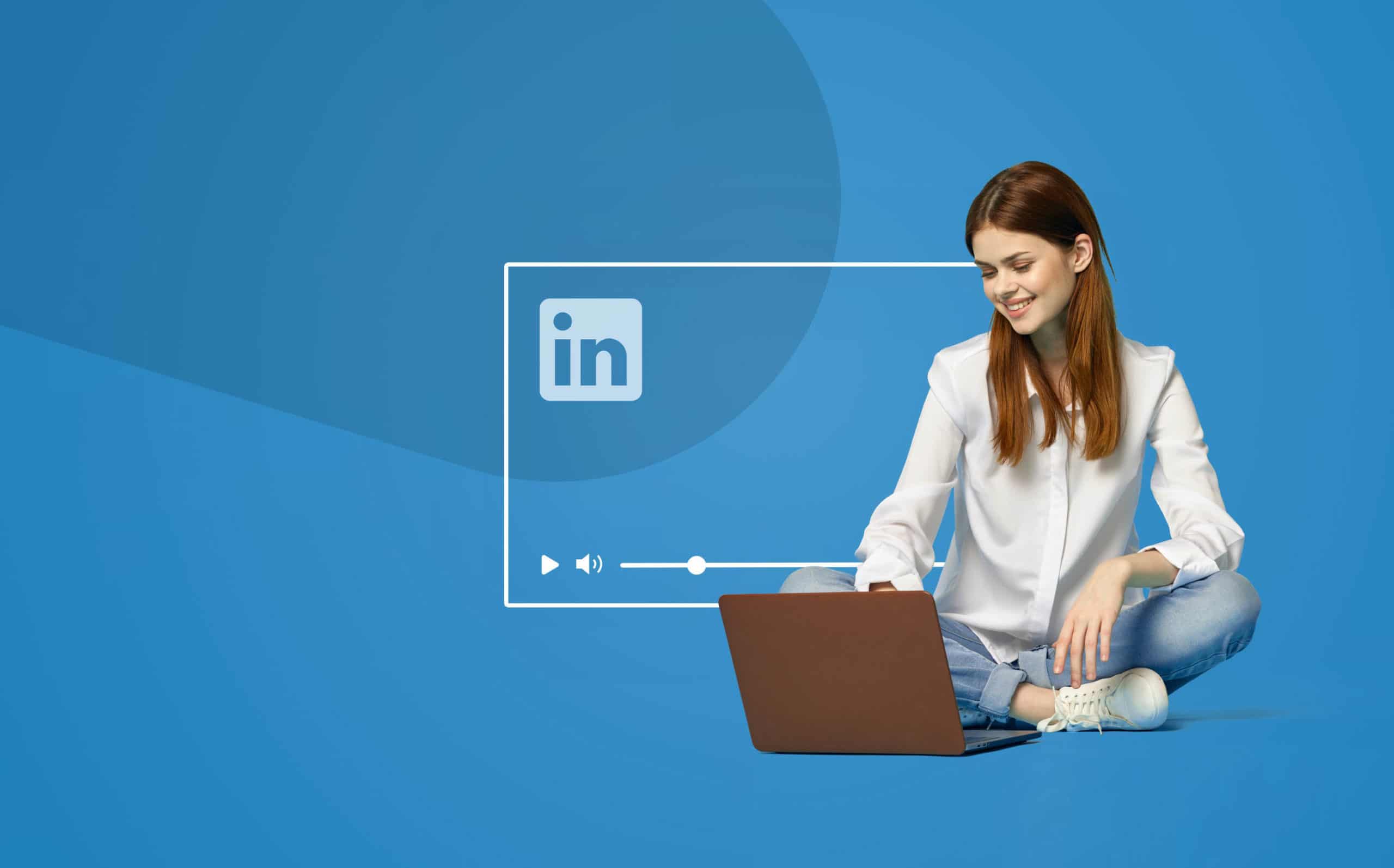
Is video branding effective on LinkedIn?
Yes, short, high-quality videos significantly boost engagement. Make sure they have consistent branding, like a branded intro and outro.
What if I don't have a banner image?
You should create one. A blank banner is a missed opportunity to showcase your brand. A simple design with your logo and tagline is better than nothing.